Re-design

Sometimes the website you had built either wasn’t what you hoped it would be or is simply outdated.

Keeping up to date with trends in website design in important for your business branding.

To reflect the ability of your business to stay current, your website needs to showcase this.

We have completed many website re-design’s as well as upgrades, to help automate business processes.

We work closely with you to develop your idea’s of what you want now.

We also think ahead to make sure the infrastructure of your website is future-proofed.

Here are a couple of examples:


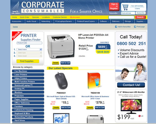
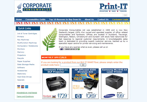
Corporateconsumables.co.nz
  • This client wanted modern look which met the expectations of their existing and new customers.
  • Their was no Search feature and many of the Print related products weren’t able to be found easily.
  • Each product group was shown in list view with no images until each image was clicked.
  • The Cart system wasn’t obvious so needed to have clear login and cart info.
  • Marketing was restricted to certain pages and certain areas.
  • The website width was set for monitors of low resolution of 800 pixels wide.
  • The new look had to be able to integrate with .tlc based coding system currently being used to manage the back-end.
Our Solution:
  • Re-design with fresh clean modern look in mind using Company colours.
  • We made the existing logo more dominant and added a strong background graphic that represented the Corporate name. The background was supplied in hi-res to client for print and other projects.
  • We created a self-contained search feature using javascript to provide the easy search ability of Printer supplies.
  • All Products are now shown with vibrant photos at all stages.
  • Using a large red and white background both logging in and cart contents can be easily seen and checked out.
  • The navigation was updated with dropdown menus as the top as well as popular search options displayed left column as expandable buttons. These features combined with a working Search area made the website fool proof for new and existing users.
  • Right side column is allocated for Marketing and can be switched on/off for any pages.
  • The website width was set to accommodate 1024 pixel width and more content could now be displayed on the screen.
  • We created ‘stand-alone’ HTML and javascript as exiting coding language in the backend systems was not setup to interact directly via ajax and other technologies.

The result has been an increase in sales and positive feedback from many of their 30,000 customers nationwide.

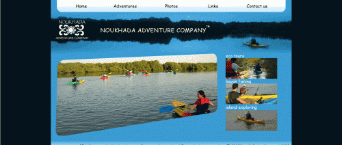
Noukhada.ae
  • This client wanted to have a fresher look that better represented their business.
  • They also wanted the ability to maintain iit without needing software or coding knowledge.
  • They also wanted to make sure it was future-proofed so as the internet evolved their website would still function and be as viewable then as it is now.
  • Like most business they also wanted people to be able find them via search engines.
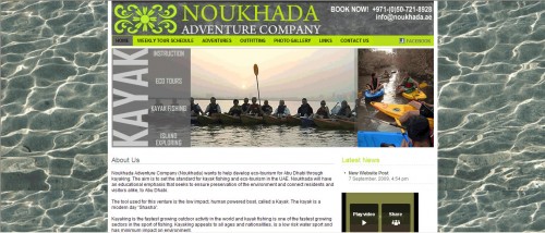
facelift_after_noukhada
Our Solution:
  • Re-design with fresh clean look in mind
  • We made the existing logo more dominant and added a funky colour as most of the target market are teens to 30’s.
  • Using WordPress CMS and WP-Remix we created the look they wanted based on other websites they liked the structure and colour combinations of.
  • WordPress is used by millions of people and has a huge contribution network ensuring it will be updated as the internet evolves.
  • Using a Search Engine plugin as well as manually submitting the website to major Search Engine companies.
  • We also created a links page as well as having reciprocal links to relevant websites in the kayaking industry.

Contact us now to ask what we can do to make your web needs a reality.

Contact us now